Decision 01
Yellow on
black is
not neutral.
The AI podcast category ran on blue. Calm, tech-forward, reassuring blue. The decision to go with sharp yellow-green (#DEFF00) on black wasn't aesthetic first. It was strategic.
Maximum visibility in the feed. Clear separation from every competing show at thumbnail size. The colour also carries a tone: energetic, direct, not clinical. If you're going to call your podcast Kollegin KI, the brand should feel like it, too.
Decision 02
One rule.
Every
format.
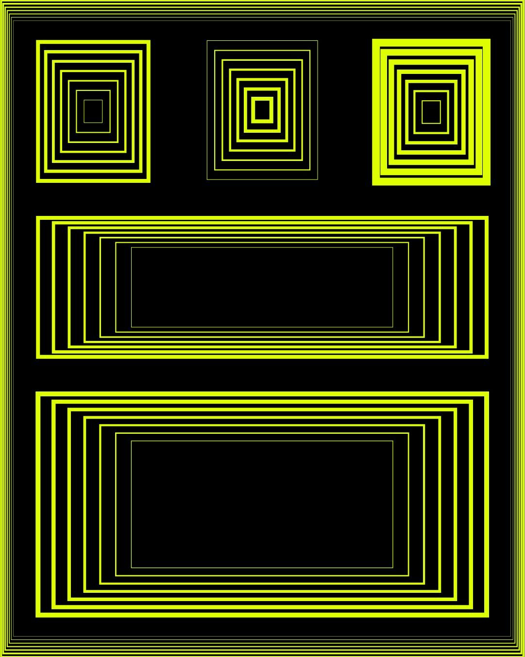
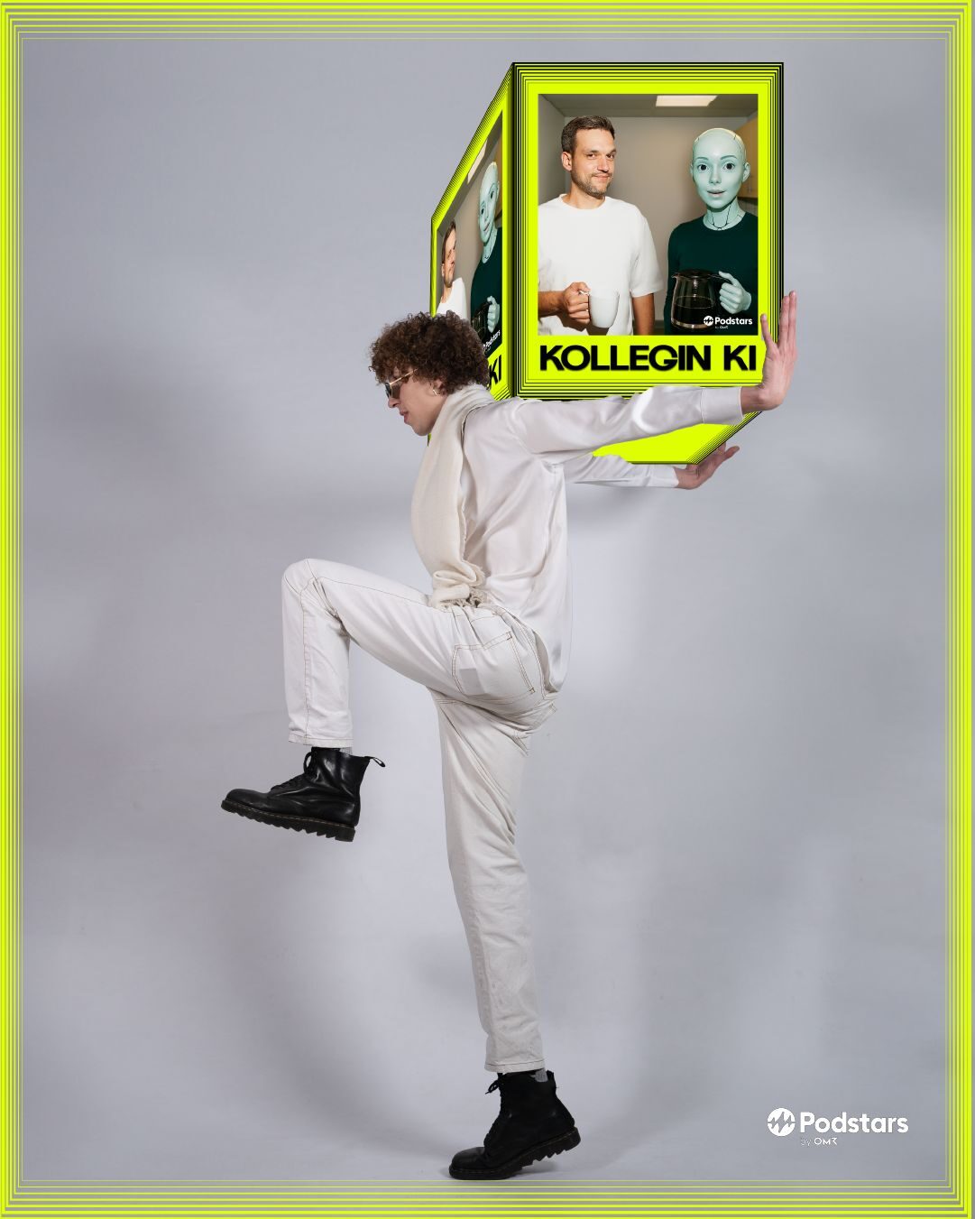
The visual anchor is a concentric rectangle. Two variants: a thick outer stroke, always 8 times the weight of the thin inner lines. Inner rectangle centered. Proportions fixed. Colours interchangeable.
That single rule generates every format without rebuilding from scratch: cover art, 9:16 stories, 1:1 posts, banners. A system, not a collection. The frame can hold a photo, a quote, a face, a still, without ever losing its identity.
Decision 03
Name
over
everything.
No logo mark. No illustrated mascot. No icon.
The name is the brand. Set in condensed heavy type, it fills the frame from edge to edge. It reads at thumbnail size. It holds at large scale. It doesn't need colour to be recognized, but in yellow on black it hits immediately. Typography as identity, not as container. The same logic as Stagona, applied to a different medium: if the name is right, it does the work.
Decision 04
Colleague,
not
threat.
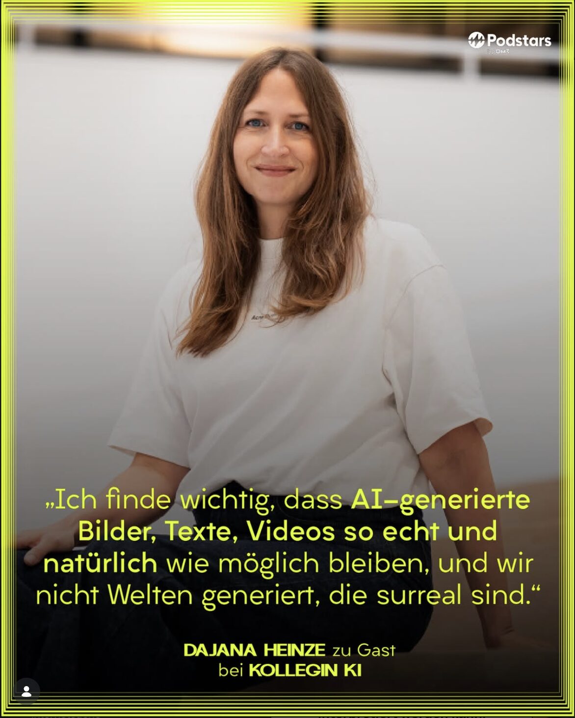
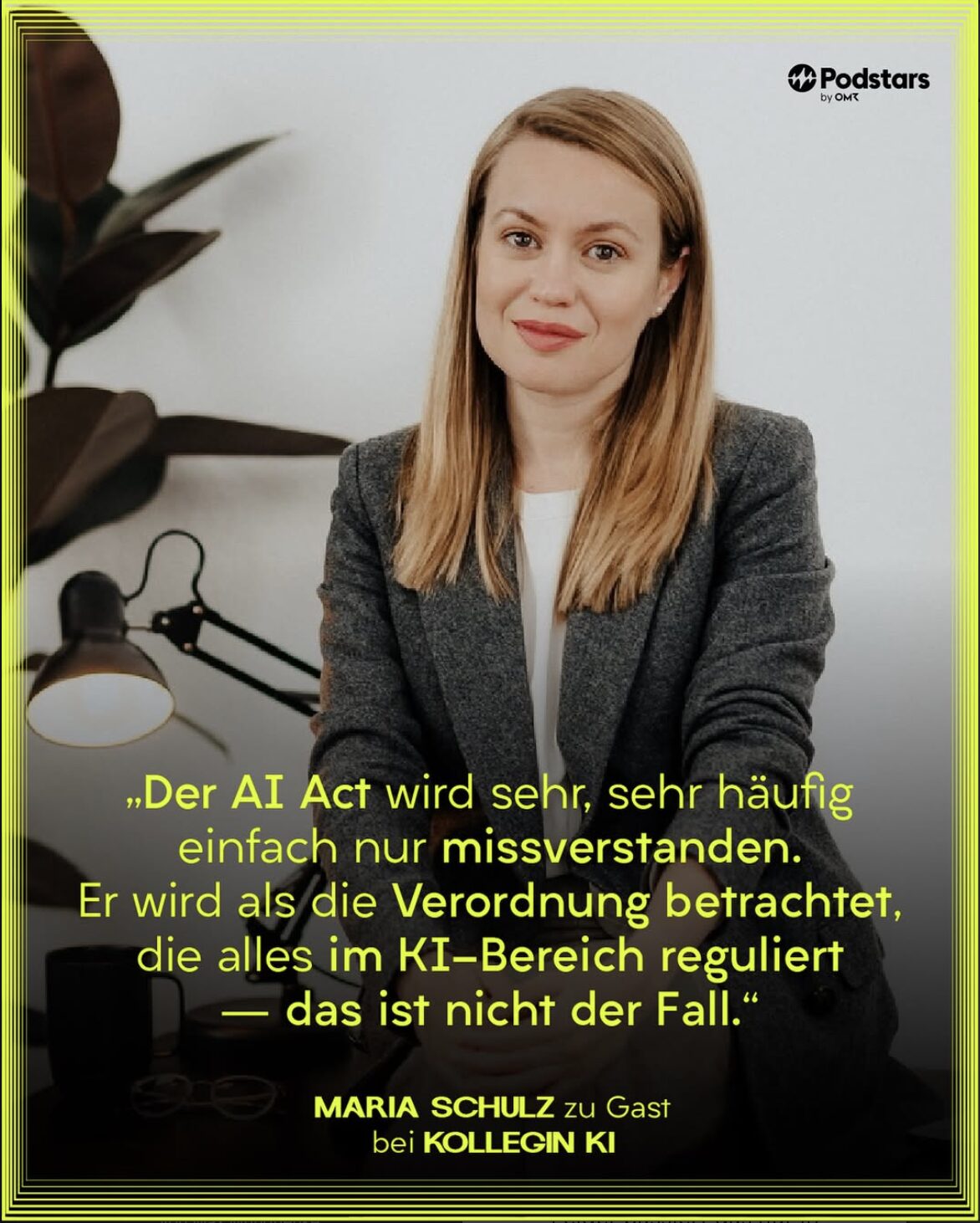
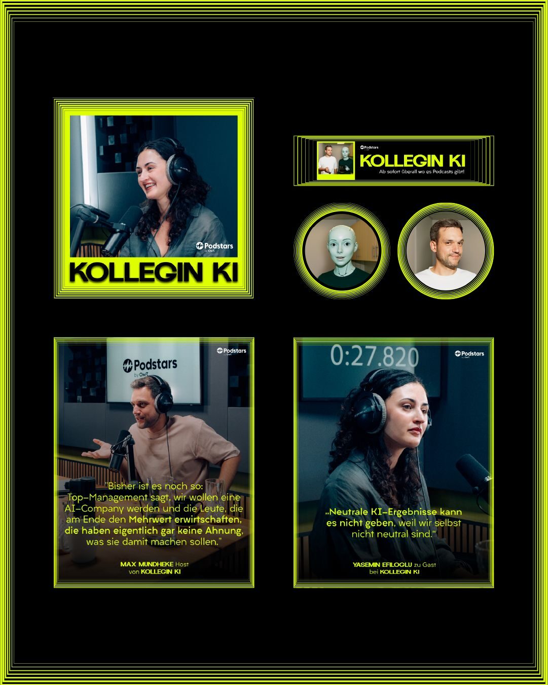
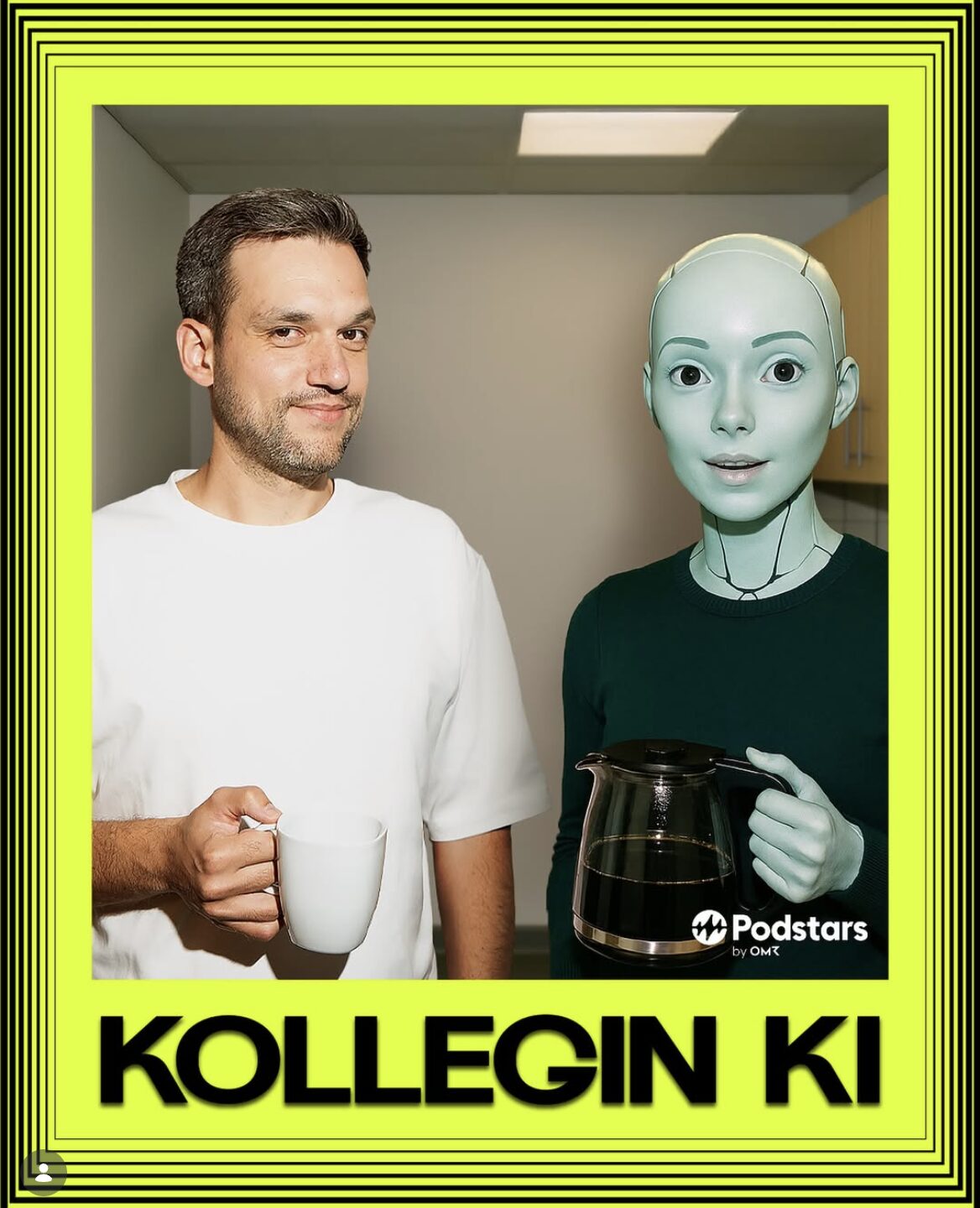
The name makes a claim. KOLLEGIN KI means AI colleague. Not AI danger, not AI revolution, not AI future. A colleague. That positioning had to come through in every touchpoint.
The cover shows a person and an AI character standing side by side, holding coffee. Not dramatic. Not sterile. A normal working relationship. The visual system reflects that: bold but not threatening, high contrast but not aggressive. The brand is confident, not alarming.