Brand Identity · Web · Freelance
Olivenöl. Pirgadikia, Chalkidiki. Seit 1922.
Brand Identity · Web · Freelance
Olivenöl. Pirgadikia, Chalkidiki. Seit 1922.
The Brief
Just four generations and a very good oil.
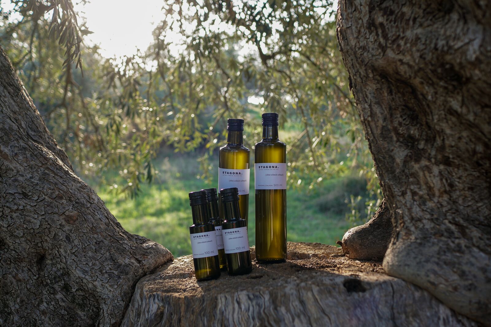
Three siblings from Hamburg wanted to sell olive oil from their family's groves in Chalkidiki. The trees have been tended since 1922, some of them centuries old, once cultivated by monks from Mount Athos. They had the product. They had the story. What they didn't have was everything else: no brand name, no visual identity, no language.
The task was to build it from zero: name, mark, label, print collateral and website. To do it in a way that matched the product's actual quality without pretending to be something it isn't.
Decision 01
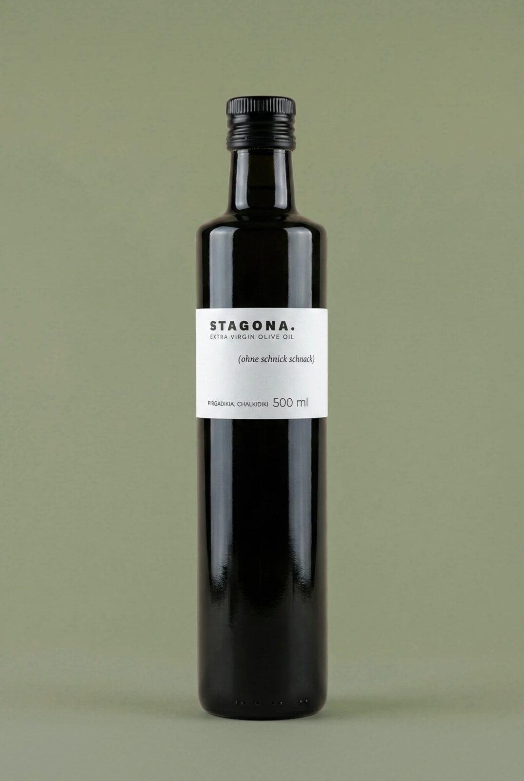
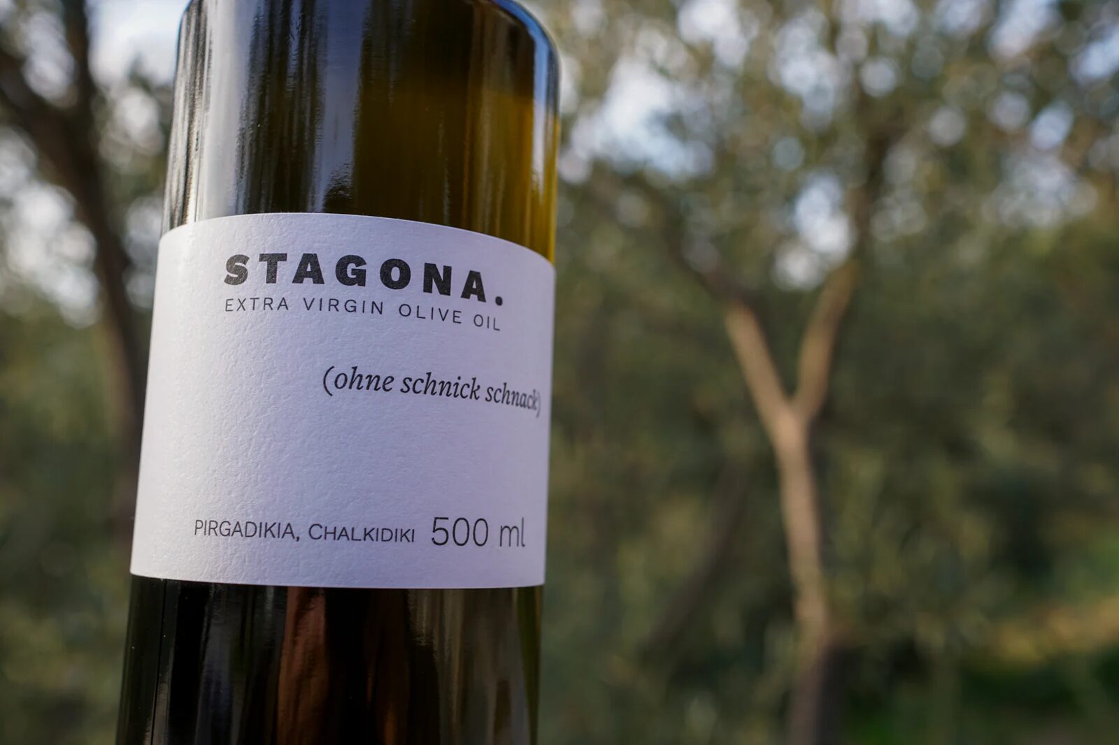
STAGONA. σταγόνα. Greek for 'drop'. The name was right immediately. But the period after it wasn't punctuation. It was a stance.
When you end your name with a period, the discussion is over. No qualifier, no flourish, no tagline you don't mean. STAGONA. says what it is and stops. That directness set the measure every other decision was held to.
Decision 02
Black and white is not minimalism. It is conviction.
The brand's own claim, OHNE SCHNICKSCHNACK, translates literally to 'without frills'. If the visual identity had used colour, decorative marks, or editorial texture, it would have contradicted the product's own voice before a single word was read. The only colour that earns its place is the colour of the oil itself. That lives in the photography, not in the brand system.
Decision 03
No logo mark. No icon. No illustration.
For a brand built on clarity and directness, a symbol would have been decoration. Instead, the name itself, set in condensed heavy type, does all the work: it scales from a 3mm label to a full-width wall, it works in every medium without a style guide, and it can never be mistaken for something else. The typeface is not a container for the brand. It is the brand.
Decision 04
A system that never breaks reads as a template. The controlled exception is what proves the system is intentional.
Within Stagona's identity, otherwise built on strict reduction, the claim OHNE SCHNICKSCHNACK steps outside the grid. Different weight, different rhythm, slightly out of alignment with everything around it. Not an accident. A decision. The break is the only thing in the entire identity that demands a second look, which makes it the thing people remember.
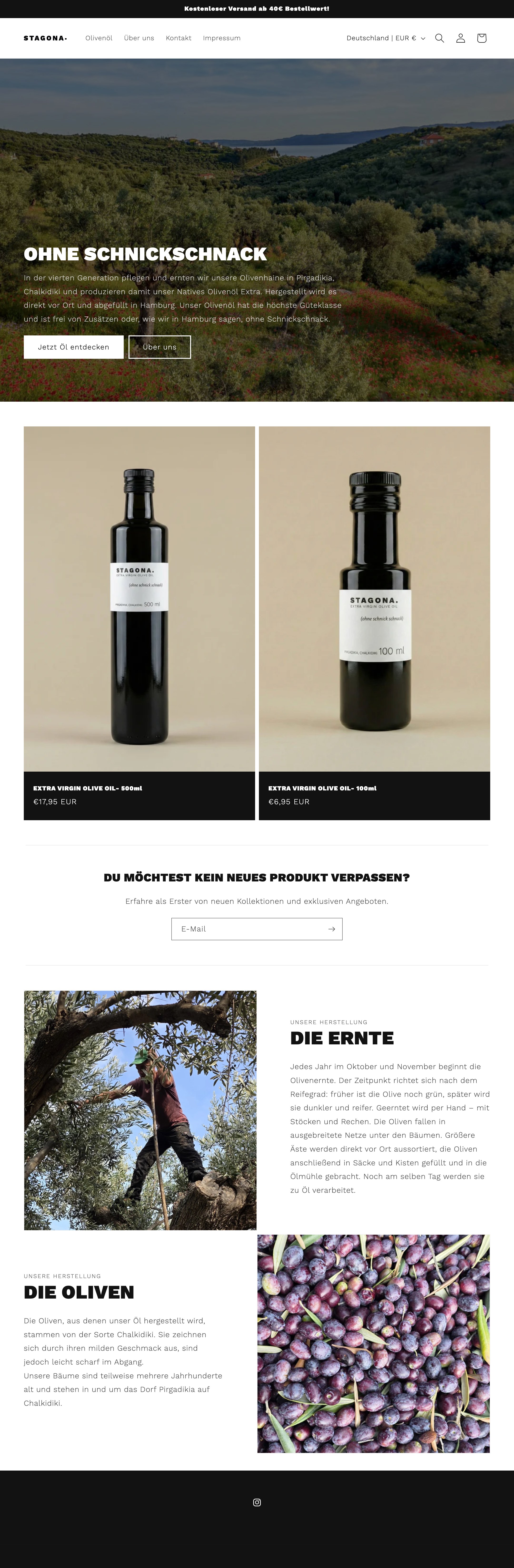
Website
stagona.eu
Built on Shopify Dawn. Condensed type, no colour, copy that means what it says. The same decisions that shaped the label appear on every page.
From logo to live store. One person, start to finish.
Outcome
End-to-end. No agency. No overhead.
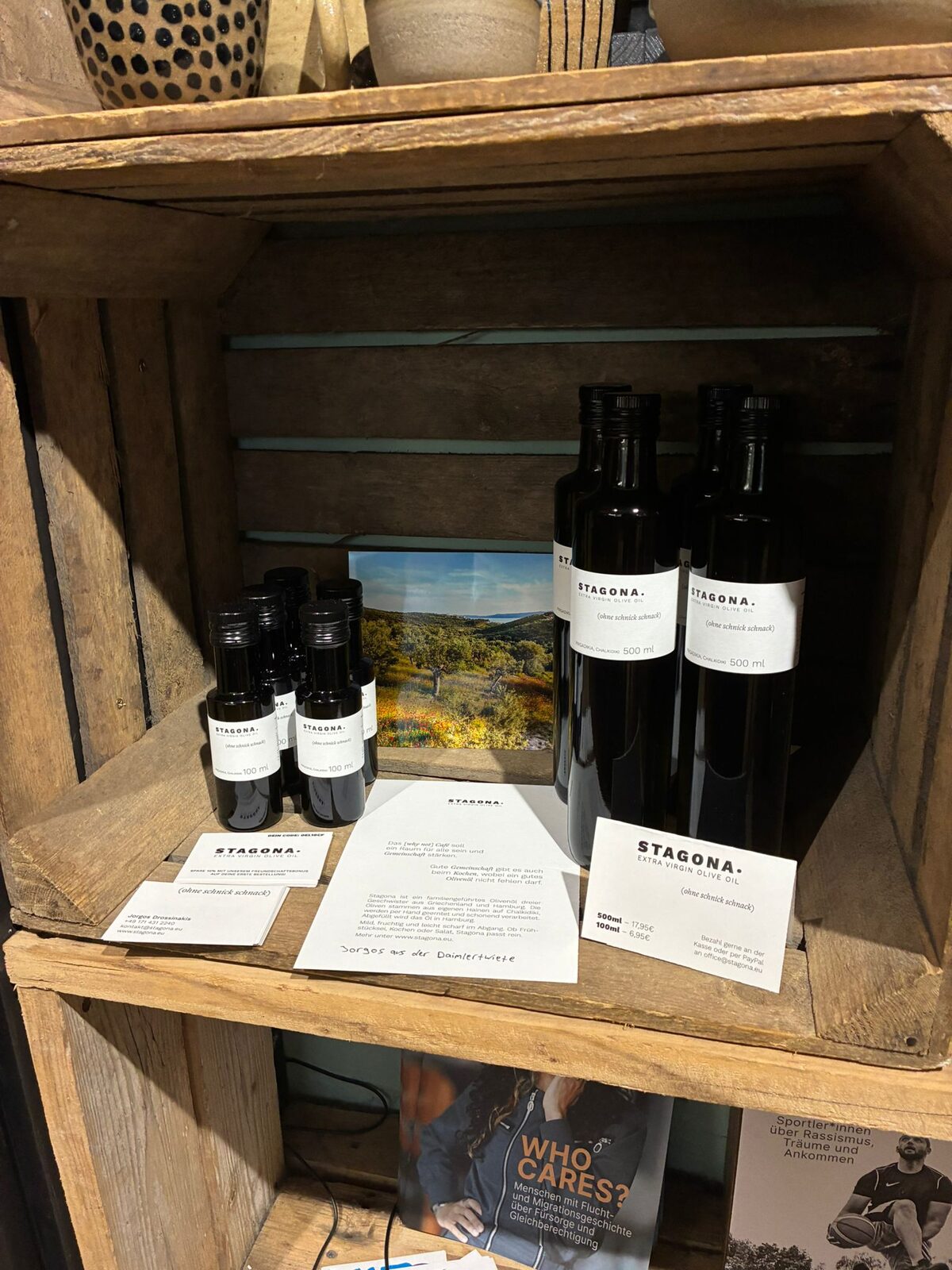
Distribution
EDEKA
Platform
stagona.eu
Deliverables
Mark · Label · Print · Web
Role
Brand Designer, sole